
Openletr
Branding and concept design for Openletr, a self proclaimed feminist blog

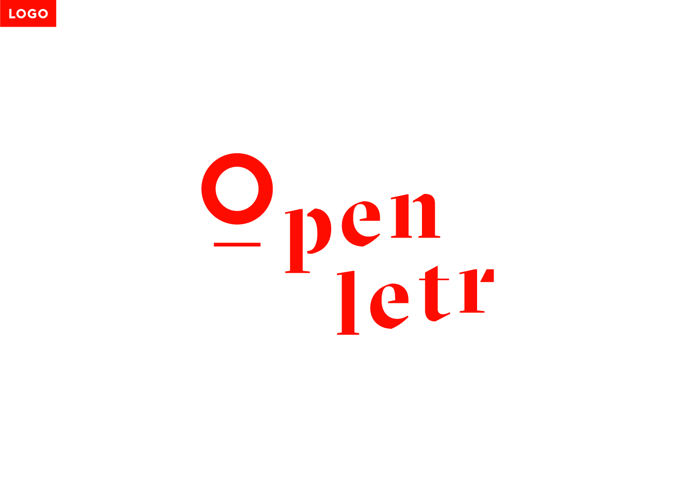
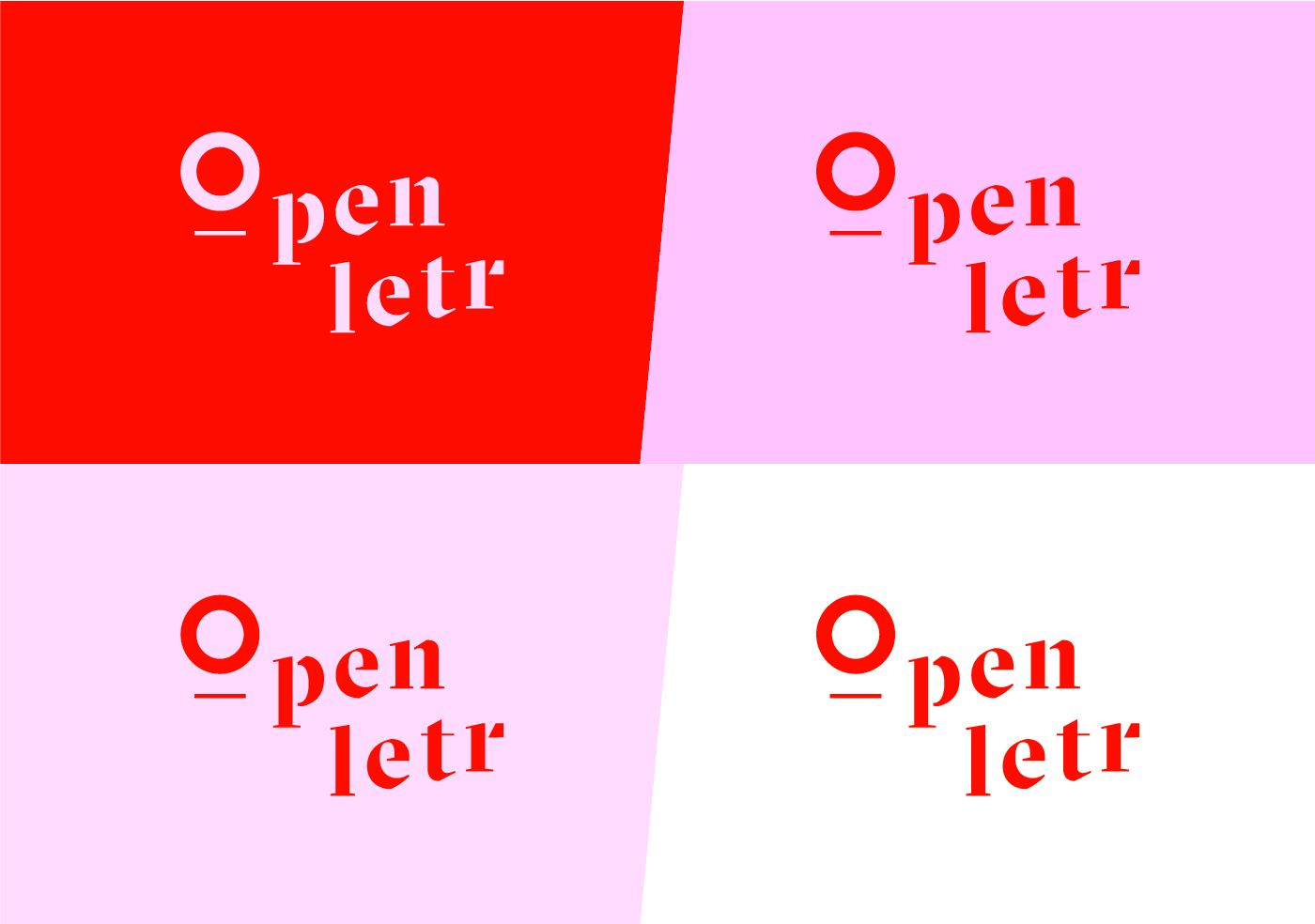

Openletr
About:
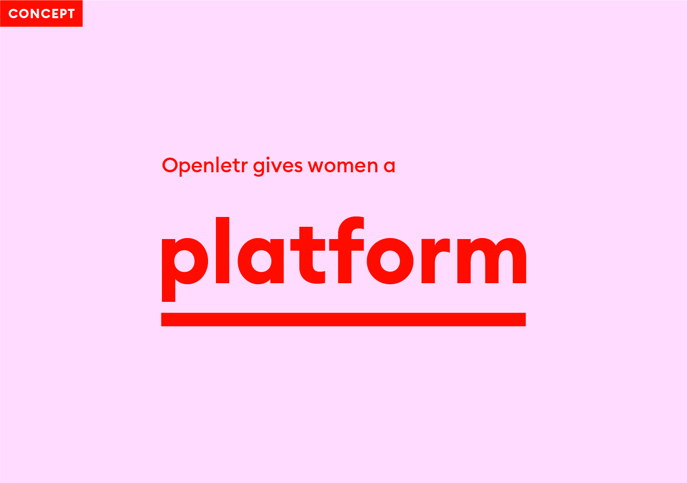
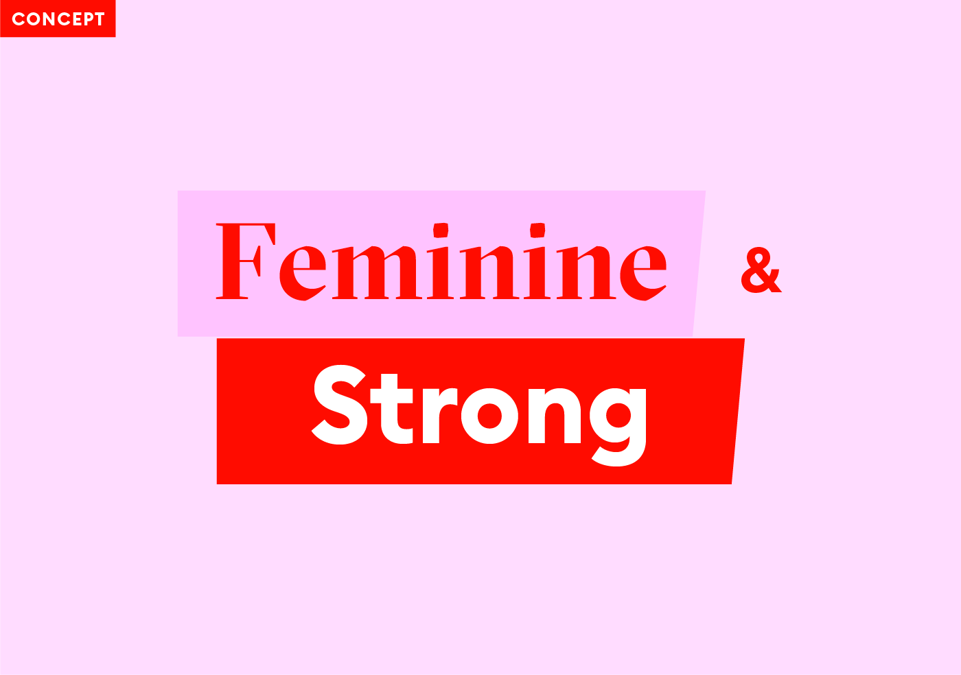
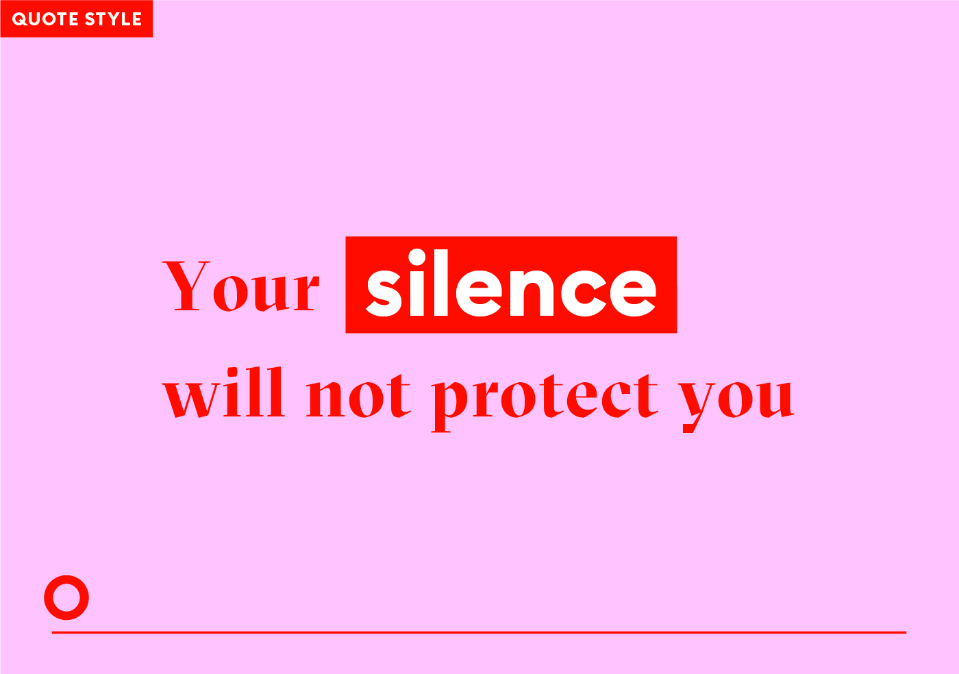
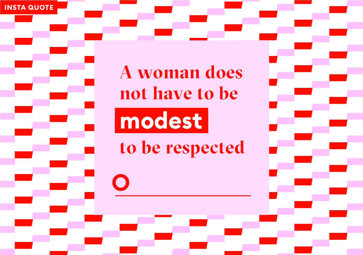
Openletr is a feminist news website with attitude and sass. The website is a platform for those whose voices have not been heard. Openletr’s aim is to break boundaries, fight stimas and stand up for survivors of sexual abuse.
Design concept:
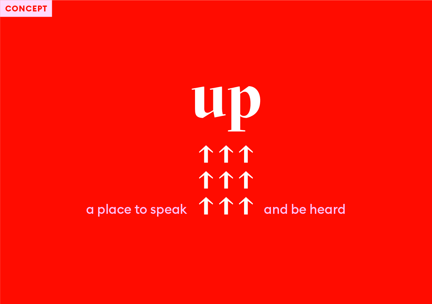
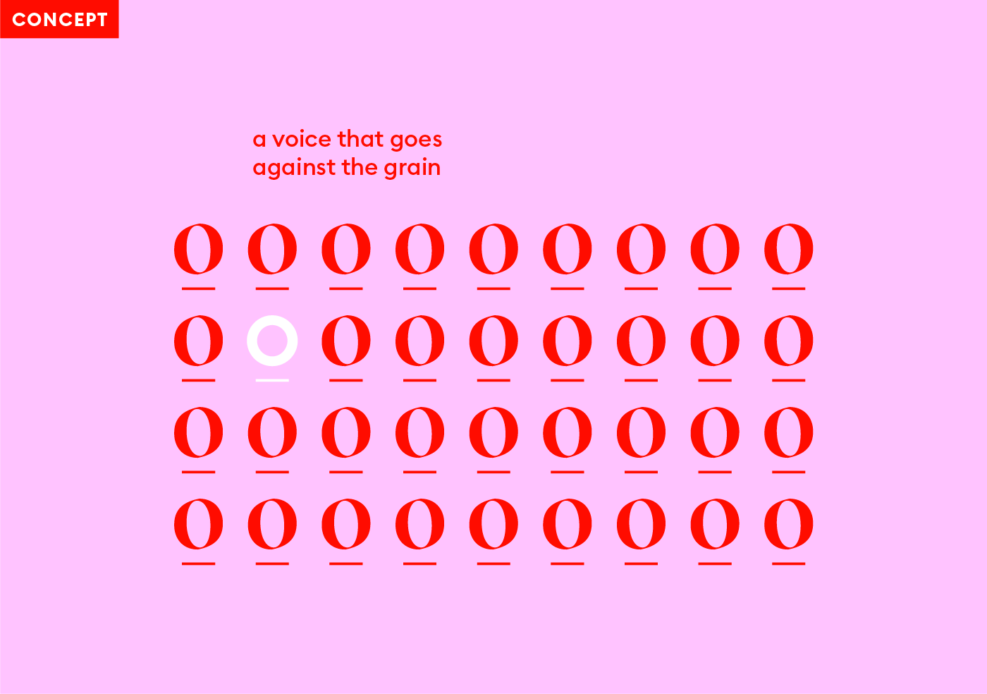
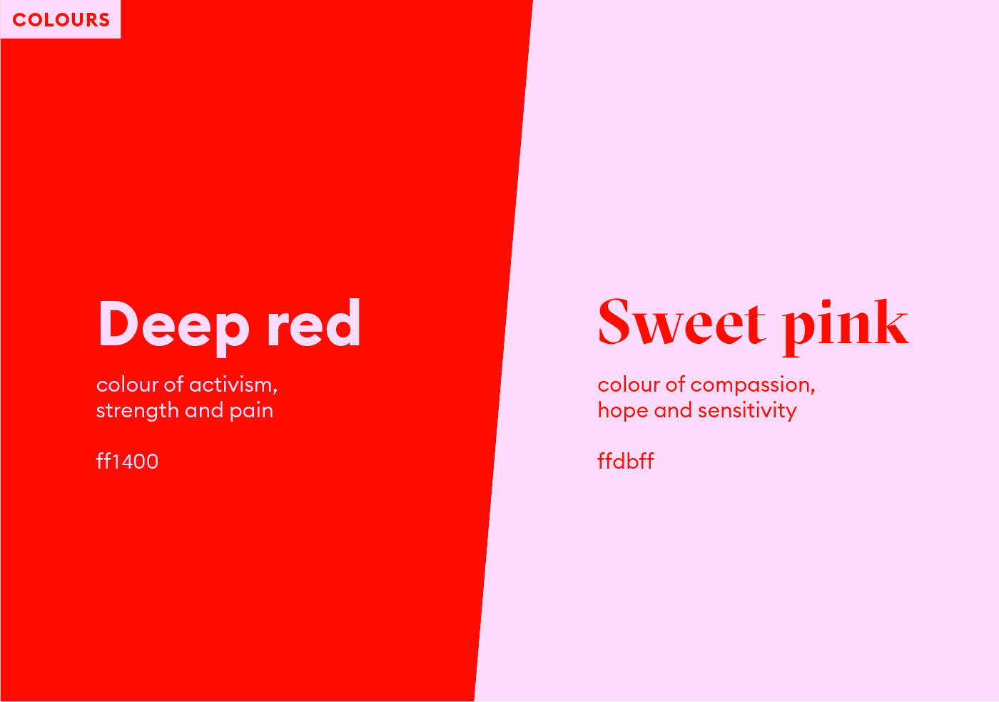
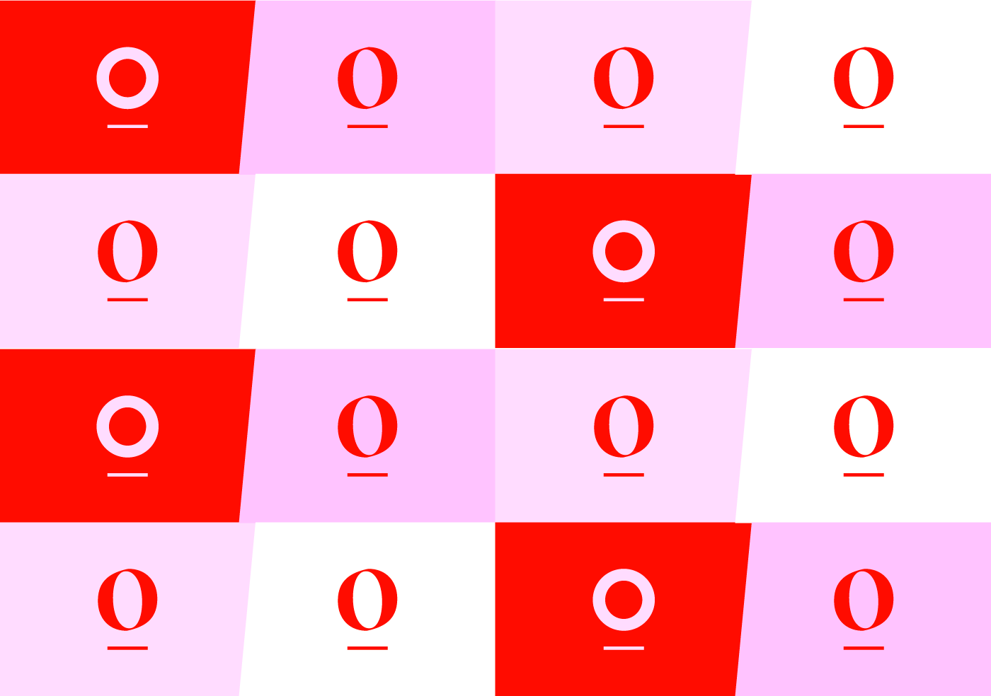
Voice – The branding represents speaking up, speaking out against the norm and being given a platform. This is symbolised through the underlined letter “O”, a mouth which stands above the other letters, as if speaking on a stage.
Acceptance – The “O” is in a different font, to portray a message of self-acceptance and embracing being different from the rest of society.
Direction – The slanted angle represents pushing society forwards and upwards.